Earth Notes: On 16WW Data Collections and Graphs
Updated 2026-06-01 13:19 GMT.By Damon Hart-Davis

Some of the data is marked up with HTML5 microdata
schema.org/Dataset. The intent is to "start with the basics" as suggested by Google, including 'DataDownload' and 'license' information where possible. (This mark-up is checked with Google's Structured Data Testing Tool.)
See available datasets for others.
This page also references circuit diagrams/schematics.
Dataset
Much data has been collected for our house at 16 Willingham Way (16WW) referred to in the various documents on this site. A lot of that data is structured and machine-readable.
The bulk of the data can be found here and is browsable, in simple text formats such as CSV. Common compression techniques have been applied for larger/non-live data sets.
- name
- 16WW bulk energy and related data
- description
- 16WW domestic energy and related data, including time series, Kingston-upon-Thames, London, UK
- version
- 1
- keywords
- domestic, home, energy, temperature, relative humidity, water
- date created
- 2007
- date published
- 2010-09-12T16:14:14Z
- date modified
- 2026-06
- temporal coverage
- 2007/..
- spatial coverage
- UK centre 51.406696N,-0.288789E elevation 16m
- distribution
- directory tree
- distribution
-
xz-compressedtar(WARNING: VERY LARGE) archive monthly snapshot of the public data files - canonical URL
- this descriptive text with markup
- DOI
-
10.5281/zenodo.10206489[hart-davis2023EOUdata] - licence
- this dataset is licensed under CC0, ie it is effectively public domain; if you make use of this data, attribution is welcome but not required
- is accessible for free
- true
Other datasets
Other available datasets (eg shards of this overall 16WW dataset).
Unstructured and Other Data
SAP and air-leakage

To set a new baseline (though some improvements have already taken place) and understand better what needed fixing, I had SAP, air-leakage and other tests done in early .
Tests/results/certificates by Tophouse for us were:
- Air test results
- SAP Energy Performance Certificate (EPC B 84)
- SAP calculations and inputs
- SAP 2005 worksheet
- RDSAP (Reduced-Data SAP) draft EPC and data input
- NHER results, calculations and data
- NHER draft results
- Building regs checks DER and TER calculations
: new EPC

In order to allow a BUS heat-pump grant, an in-date EPC is required, and it must not be suggesting any easy insulation works. The first one expired in , so I booked in a new one, with the assessor here earlier in the week. Not everything done to improve this house can be captured by rdSAP.
The renewed 16WW EPC certificate came in from Ecoalex and it is an A 100 (it was previously B 84), which is ~0.3% of existing England and Wales homes.
Grid-tie PV generation
See live generation output when possible.
: now in OpenStreetMap!

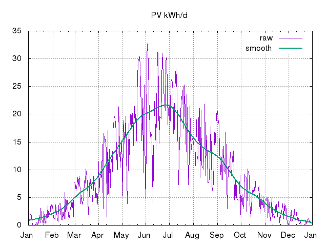
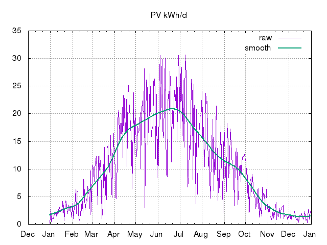
This data is collected a year at at time, though there is a chart for the whole data set, and collated daily kWh generation records with smoothing. (See the gnuplot commands.)
: the first phase/round of PV, 1.29kWp (west-facing, 6 x Sanyo HIT 215Wp hybrid crystalline/thinfilm panels with SMA Sunny Boy 1100 inverter), was installed.
See the daily PV generation logs as .csv and .png chart.
: the second phase was installed, taking the system to 3.87kWp; same panels and inverters for each of the two new east-facing strings as for the first phase.
See the daily PV generation logs as .csv and .png chart.
: the third phase (west-facing, same panels, SMA Sunny Boy 1200 inverter) of 1.29kWp was installed, taking the whole system to 5.16kWp. New tariff and generation meter for this last part.
See the daily PV generation logs as .csv and .png chart.
See the daily PV generation logs as .csv and .png chart.
See the daily PV generation logs as .csv and .png chart.
See the daily PV generation logs as .csv and .png chart.
See the daily PV generation logs as .csv and .png chart.
See the daily PV generation logs as .csv and .png chart.
See the daily PV generation logs as .csv and .png chart.
See the daily PV generation logs as .csv and .png chart.
See the daily PV generation logs as .csv and .png chart.
See the daily PV generation logs as .csv and .png chart.
See the daily PV generation logs as .csv and .png chart.
See the daily PV generation logs as .csv and .png chart.
See the daily PV generation logs as .csv and .png chart.
See the daily PV generation logs as .csv and .png chart.
See the daily PV generation logs as .csv and .png chart.
See the daily PV generation logs as .csv and .png chart.
See the daily PV generation logs as .csv and .png chart.
(See the gnuplot commands for annual plots, and the current awk 'V2' smoothing code
('V1').)
See other system performance records, including per-string outputs.
: Intraday data
Rob Ferber of ElectronVault wrote to me looking for intra-day generation data (with 10 minute sampling intervals). I had at that time exposed very little because of data clean-up issues. (Such as bizarre time offsets in the Sunny Beam apparently attempting to correct to German civil time even though I keep it on UTC, serial numbers, corrupt data, slight drift of Sunny Beam from true UTC, etc.)

I capture these intraday samples manually after dusk about twice per month. Sometimes also I capture data on particularly 'interesting' days, of late using the SunnyBeamTool by Michaël Peeters on my SheevaPlug (and now, as of , Raspberry Pi B+) ARM Linux system. I did not do this continuously because I have not been able to stop the Sunny Beam apparently drawing considerable power via the USB port, and because the SheevaPlug did not have a 'spare' USB port: I manually disconnected the USB I/O board temporarily to connect the Sunny Beam. (As of experimentally I have the Sunny Beam plugged in permanently, and take 5-minute samples during daylight hours.)
Rob produced lovely tweaked graphs from my raw data up to . Thanks, Rob: great job!
Prior to Rob's analysis I had made public but not announced these intraday samples from SMA's Windows application, with no explicit time correction:
The entire raw data set is now available, including new samples as I take them, though with many caveats (beware timestamp wobbles in particular).
See the interesting (cloudy) morning dip in PV output (raw Sunny Beam data with time offset, per-minute data) during the partial solar eclipse (~85% maximum at ~09:30).
PVGIS Prediction
Here is an extract of the numbers from the PVGIS estimate not knowing anything about our local trees, etc!
Solar radiation database used: PVGIS-classic
Nominal power of the PV system: 5.2 kW (crystalline silicon)
Estimated losses due to temperature: 7.3% (using local ambient temperature)
Estimated loss due to angular reflectance effects: 4.1%
Other losses (cables, inverter etc.): 14.0%
Combined PV system losses: 23.5%
Fixed system: inclination=23°, orientation=-90° Month Ed Em Hd Hm Jan 2.78 86.0 0.73 22.6 Feb 5.36 150 1.34 37.4 Mar 8.83 274 2.16 66.8 Apr 14.40 433 3.57 107 May 17.80 552 4.51 140 Jun 18.20 545 4.65 140 Jul 18.20 564 4.69 145 Aug 15.60 483 4.02 125 Sep 10.70 322 2.72 81.7 Oct 6.57 204 1.67 51.7 Nov 3.43 103 0.89 26.8 Dec 1.94 60.1 0.52 16.2 Yearly average 10.3 315 2.63 80.0 Total for year 3780 960
Ed: Average daily electricity production from the given system (kWh)
Em: Average monthly electricity production from the given system (kWh)
Hd: Average daily sum of global irradiation per square meter received by the modules of the given system (kWh/m2)
Hm: Average sum of global irradiation per square meter received by the modules of the given system (kWh/m2)
Note also that adding just 10% (~500Wp) vertically mounted south-facing PV would add about 1/3rd to mid-winter generation from the main array (ie ~1.6kWh/d actual from the roof and ~0.5kWh/d from the new array predicted.)
Nominal power of the PV system: 0.5 kW (crystalline silicon)
Estimated losses due to temperature and low irradiance: 6.1% (using local ambient temperature)
Estimated loss due to angular reflectance effects: 4.3%
Other losses (cables, inverter etc.): 14.0%
Combined PV system losses: 22.7%
Fixed system: inclination=90°, orientation=0° Month Ed Em Hd Hm Jan 0.58 18.0 1.40 43.5 Feb 0.79 22.2 1.94 54.2 Mar 1.16 36.0 2.89 89.7 Apr 1.25 37.6 3.25 97.4 May 1.06 32.9 2.87 89.1 Jun 1.01 30.4 2.81 84.2 Jul 1.04 32.2 2.88 89.2 Aug 1.06 32.9 2.87 88.9 Sep 1.17 35.0 3.05 91.5 Oct 0.96 29.8 2.44 75.5 Nov 0.73 22.0 1.80 53.9 Dec 0.53 16.4 1.27 39.3 Yearly average 0.946 28.8 2.46 74.7 Total for year 345 896
Off-grid battery voltage/state

I log some aspects of my off-grid system such as live values for voltage, calendar month chart, and historic stats.
(See the gnuplot commands for live voltage plotting.)
Meter readings
Monthly meter readings and comments.Gas consumption

Gas consumption for hot water, central/space heating, and cooking, (manually) converted to monthly kWh/d figures, suitable for gnuplot to digest. (See the gnuplot commands.)

Annual gas consumption in kWh, suitable for gnuplot to digest. (See the gnuplot commands.)
Gross electricity consumption
")
Gross electricity consumption, ie compensating for microgeneration from PV, as if the PV were not there, in monthly kWh/d, suitable for gnuplot to digest. (See the gnuplot commands.)
Note the abnormally-high electricity consumption during the pandemic lockdown, roughly to , that final month being the highest ever.
")
Gross annual electricity consumption in kWh, suitable for gnuplot to digest. (See the gnuplot commands.)
Footprint from electricity and gas
 Electricity and gas (eg heat+light) annual carbon footprint in kgCO2e,
suitable for gnuplot to digest. (See the gnuplot commands.)
Electricity and gas (eg heat+light) annual carbon footprint in kgCO2e,
suitable for gnuplot to digest. (See the gnuplot commands.)
Heating Degree Day data
Partial monthly summary of local HDD12 (base temperature of 12°C) data suitable for gnuplot to digest.
See annual data too.
Water mains inlet temperature
See 16WW water mains inlet temperatures for an idea of how much extra "lift" is required by the DHW system in winter, for example.
Relative humidity
See some manual relative humidity (RH) measurements at 16WW.
Also in the context of thermal discomfort.
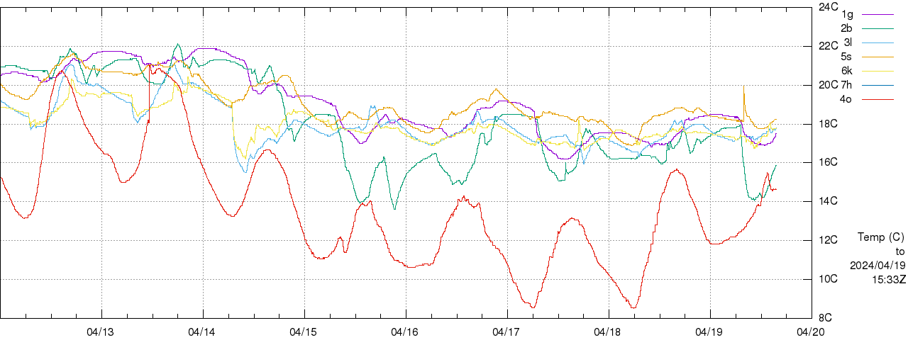
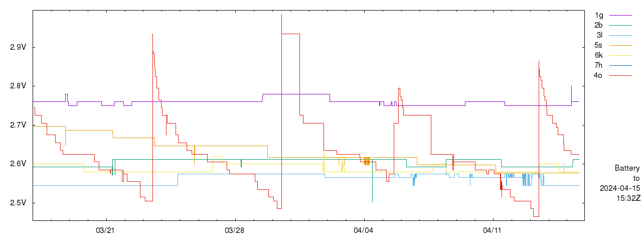
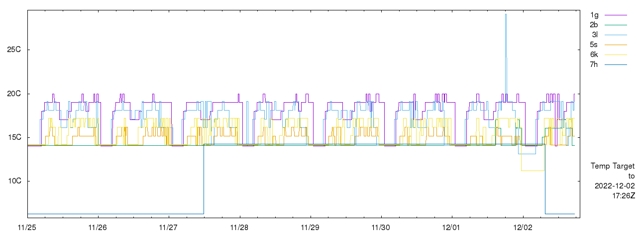
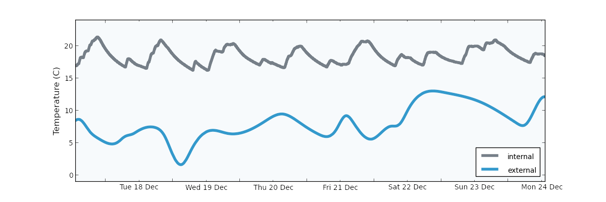
Local temperature (etc) monitoring
See a graph of local internal temperature at 16WW collected from an OpenTRV unit tethered to the Web server.

For the 16WW OpenTRV devices see:
- ambient temperature (larger).
- sensor battery voltage and off-grid main battery temperature.
- relative humidity.
- temperature target (not live).
- temperature setback (not live).
- valve % open (not live).
- valve % cumulative movement (not live).
- ambient light levels and deltas (not live).
and also see a snapshot.

See initial data sets for server-local and all sensors, including external, for the end of .
See the OpenTRV/16WW public data set. Note that data formats have evolved over time, but are all plain text, in various common compressed archive formats for speed of download, etc.
: iButton temperature monitoring
iButtons logged temperature from to .
See: A Note On iButton Temperature Logging of Insulation Performance and data set.

: MyJoulo
I look up the offer at MyJoulo to place a small widget on top of my thermostat for one week to analyse our heating. Our unit arrived and ran until Christmas Eve.
See the generated analysis page (local copy) and the raw CSV data. (Also note that this sensor was about 2m away horizontally from button 3 in the iButton mission 5.)

The take-home message from the analysis is that it believes that we have our living room at the average UK 19°C and that our living room temperature varies between about 16°C and 21°C generally in a sawtooth pattern. (Note that 18°C in the morning before school seems to suffice.)
Note that from early evening I lowered the radiator flow temperature from about 60°C to about 45°C, independently of this, to see if the i30 PRC/eTRV could work with a lower heating rate. The reduced flow temperature seems to help reduce overshoot both in the target bedroom and in the living room, though the motivation was to try to test at typical heat-pump temperatures.
Note that we don't leave our house thermostat in the living room alone; we keep it lowish unless we feel cold and/or we want to force the heating on for the children's bedrooms before they go up. The latter action would be unnecessary if we had zoning with each bedroom able call for heat independently and those wasteful and soporific peaks >19°C could probably be trimmed. In the interim we should probably make sure that we get the thermostat down to ~18°C as the children go to bed to minimise overshoot.
A friend has generously provided his raw CSV data and chart too (from somewhat east of London), for comparison. In his case there is evidence of much tighter temperature control, at a similar mean level to ours, even with lower external temperatures.
: Temperature and relative humidity data from thermal discomfort study
At the end of I participated in a UCL Energy Institute/LoLo study on responses to thermal discomfort, in return for access to the raw data collected by them on temperature and relative humidity at 16WW, which overlaps with some of my iButton mission 4 data collection.
Three draft plots (based on the sensors at 4 heights in each room):
- temperature and RH% in each room vs outside
- RH% against height in each room
- temperature against height in each room
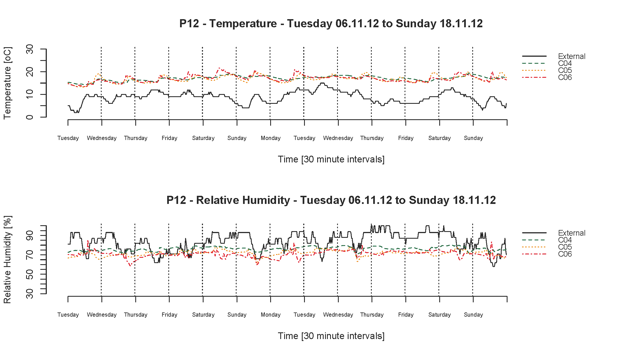
were made available first, right at the end of the year. (The visible codes are: C04 Bedroom, C05 Living Room, C06 Kitchen.)
See the underlying raw data (note the room codes above on the filenames) in Mac .csv file format (with lines CR terminated, not CRLF or LF), from Stephanie Gauthier (then) of UCL whose project this was for,
ZIPped.
: 16WW High Resolution Temperature/RH Dataset
An independent set of 16WW room sensors and radiator sensors recorded high-resolution fine-grain temperature (30s sampling) and relative humidity (60s sampling) data.
Air Quality Egg (AQE)
I did not have much joy attempting to measure "air quality" with the AQE Air Quality Egg. These things are hard to do well and cheap at the same time.
Schematics
- Off-grid PV system schematic (Ki-CAD) including various snapshots image/other formats.
- : off-grid (lead-acid and LiFePO4/LFP) power system circuit diagram .SHX, PDF.
Logging (k8055)
All historic logging data from the k8055, mainly off-grid numbers, is available under data/k8055/YYYY-MM.gz, and a log of system changes is at the end of
the historic stats.
Lead-acid voltage/SoC chart
Here is Solar John's SOC chart reproduced with permission, along with his note: "it provides only a rough estimate of the actual SOC":
| % Charge | Charging | At Rest | Discharging |
|---|---|---|---|
| 100 | 14.75 | 12.70 | 12.50 |
| 90 | 13.75 | 12.58 | 12.40 |
| 80 | 13.45 | 12.46 | 12.30 |
| 70 | 13.30 | 12.36 | 12.25 |
| 60 | 13.20 | 12.28 | 12.15 |
| 50 | 13.10 | 12.20 | 12.00 |
| 40 | 12.95 | 12.12 | 11.90 |
| 30 | 12.75 | 12.02 | 11.70 |
| 20 | 12.55 | 11.88 | 11.50 |
| 10 | 12.25 | 11.72 | 11.25 |
See also, for example Battery State-Of-Charge Chart For Voltage & Specific Gravity and Batteries Maintenance 101.
Lead-Acid Battery State of Charge vs Voltage (Richard Perez, Home Power #36, Aug/Sep 1993) notes that "At 32°F (0°C), the effect of temperature becomes pronounced enough to distinctly change not only the battery voltage vs. SOC profile, but also its useful Ampere-hour capacity. The discharge voltage curves may be depressed by as much as 0.5VDC from those shown on the graph. Charge voltages will be elevated by as much as 0.5VDC for a cold 12 Volt lead-acid battery." (This chimes with, for example, Victron's -24mV/°C threshold adjustment from a 20°C baseline.)
Factoids
A few random facts that are useful for rules of thumb, etc:- A person exhales ~1kg/d of CO2 (~0.5m^3).
- A continuous 1W UK mains electricity draw costs ~1£/y circa .
- Our portable dehumidifier ( vintage) consumes ~1kWh to remove 1kg of water from the air (and is a CoP>1 heater). It may have been managing to extract a peak of ~2l/2kg per hour, eg helping to dry out a recently-plastered room ().
- Q10=2 applies to max absolute humidity vs air temperature (ie equilibrium absolute humidity approximately doubles (and so %RH halves for a fixed g/m^3 of water) for each 10K (or °C) increase in temperature).
- Heat capacity of water ~116kWh/t for a delta-T of 100K (~10t/MWh), ~90kWh/t for a delta-T of 80K, ~60kWh/t for a delta-T of 50K (eg from 90°C down to 40°C in a DHW tank), or 2.3kWh for 200l DHW tank falling from 55°C to 45°C or mains at 10°C preheated to 20°C in winter (10K) and note tank losses ~1kWh/d ballpark. Compare with well under 30kWh/t for lead-acid batteries (16kWh/t for AGM @ typical 50% DoD), 100kWh--200kWh/t for Lithium-chemistry batteries.
- Approx lighting levels for office and better lit parts of home 400lux, dimly lit living areas of home 80lux.
- Fieldlines thread: ... the consensus was that a good cyclist can achieve 150 watts hour after hour, a professional cyclist can do 200 watts all day, and at Olympic level they can mange 250 watts for an hour or two but still keep up the average 200 watts. A 'normal' adult can maybe sustain 100W for a reasonable time, and note that resting heat output is also 100W, presumably leading to nearly 200W total output.
- Hours of sun per year USA vs Europe: SW US 3500+, UK south coast 1800--2600, north Scotland <1200.
- "Ordinary" radiator output into 20°C room relative to 70°C flow: 30°C/13.5%, 40°C/32.1%, 50°C/53.0%, 60°C/75.8%.
Code
GB grid intensity
Code used to collect and compute GB grid intensity numbers, live and historical, published under an BSD-style free/open licence on GitHub:
reutils.
: archival initial snapshot of Eclipse project:
- GZIPped tar image (348405 bytes):
code/reutils-1.0.0-SNAPSHOT.tgz - ZIP file (366206 bytes):
code/reutils-1.0.0-SNAPSHOT.zip
Other
Just for giggles, note that there's nothing secret about the
makefile
used to build this site, though note that for tidiness not all of the supporting scripts are in public view. If anyone really cares I can make some or all of them visible too.
References